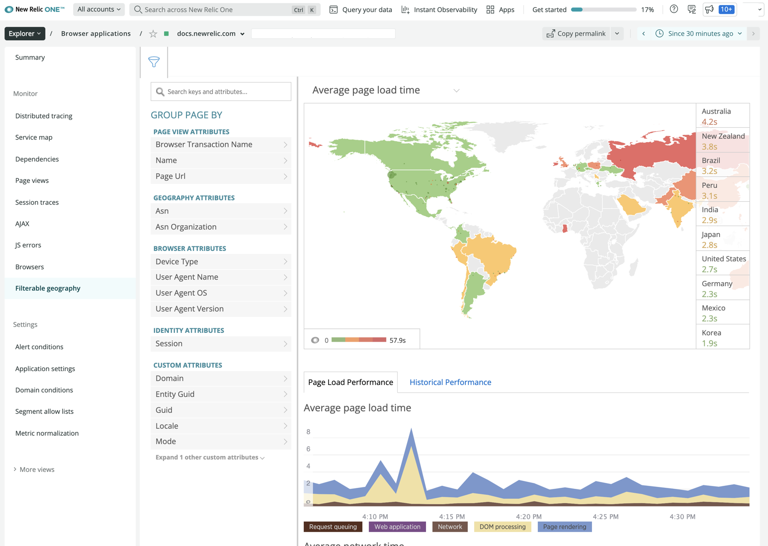
For New Relic browser monitoring, the filterable geography UI page provides a world view with color-coded performance information about cities, regions, and countries anywhere around the world. You can filter and drill down into detailed information, or use your mouse to select or zoom in and out of any location on the map.
The enhanced attributes provide deep visibility not only about your end users' experience with page load timing, but also with network performance anywhere around the world. This level of visual detail is especially useful for professionals in IT and Operations to make business decisions about peering agreements and CDN usage.
Requirements
- Requires the Pro or Pro+SPA agent type
Factors affecting collected data
To capture page load timing information, the agent uses the Navigation Timing API, which most (but not all) browsers support. If the browsers do not support the Navigation Timing API, then the UI charts and data points can only show the network data they receive for DNS lookup, connection, secure handshake, etc. This may not be 100% of the app's overall traffic.
Also, firewalls may have an impact on the geographical data collected about your end users.
View performance data by location

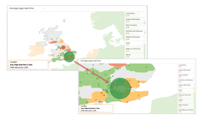
one.newrelic.com > Browser > (select an app) > Browser app > Filterable Geography: Here is an example of the map before drilling down into detailed information about London, England.
To view or sort the performance information by location:
- Go to one.newrelic.com > Browser > (select an app) > Filterable Geography.
- Select the type of performance data to view from the dropdown, or use the default Average page load time.
- To drill down to a specific area, mouse over or select any area on the geographical map, or select any of the ten worst performing locations from the list to the right of the map.
- To view specific performance metrics, select any of the attributes below the funnel icon.
- To view comparison data, select the Page load performance or Historical performance chart below the selected location's geographical map.
Use map functions
Use any of New Relic's standard user interface functions and page functions to drill down into detailed information. Here is a summary of additional options with the Filterable Geography page.
If you want to... | Do this... |
|---|---|
Change what kind of performance data appears | Select your choice from the dropdown. Default performance indicator is Average page load time. The map's legend lists the ten best or worst performing areas (depending on the selected performance indicator) for the selected time period. For example:
|
View summary performance information about a specific location | Mouse over any colored area on the map, select a location from the list, or zoom in and out of any area on the map. |
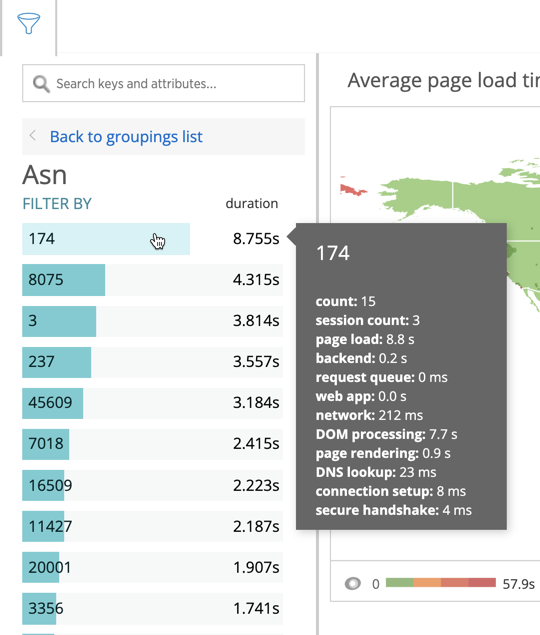
View detailed data for a location | Select any area of the map. For example:
|
Hide the list of available attributes | Select the funnel icon. |
Return to a larger world view | Select another location on the map, or clear the filter labels above the map. TipTo return to the original map view of the world, select any area on an ocean. |
Examine heat map details

one.newrelic.com > Browser > (select an app) > Browser app > Filterable Geography: Here is an example of the map as you use filter and zoom tools to drill down into detailed information about London, England. Athough overall throughput for the area is good (green), the nearby yellow areas, and the smaller red and orange circles indicate nearby cities with varying levels of throughput problems, not the size of those cities.
The Filterable Geography heat map identifies performance quality with color and with the size of circles.
Heat map | Description |
|---|---|
Color scale | Performance quality ranges from green (the best) to yellow, orange, and then red (the worst). When selecting indicators of usage rather than performance, the heat map shows shades of purple, with the darkest shades indicating the highest usage. The color scale adapts to your app's specific performance. Each area is a percentile range. To view the range for each color segment, mouse over the heat map's legend. |
Thresholds | Different thresholds are dynamically applied to the colors based on the type of performance indicator you select from the dropdown and the maximum value your app has reported. For example, green for Average page load time may indicate 0 to 3.3 seconds, while green for Average network time may indicate 0 to 256 milliseconds. |
Circles | The map's colored circles help you identify areas with performance problems at a glance. Each circle's radius is based on throughput reported for the city it represents, not the size of the city itself. You may see many circles overlapping each other. This usually indicates a grouping of metropolitan areas which represent a geographic area of heavy traffic. |
Filter performance metrics
The Filter feature allows you to select and group data by attributes in various categories, including:
Page view
- Geography
- Browser
- Identity
- Custom

The filtered results appear on the geographical map, where you can use any of the standard map functions to explore additional details. Here are some examples.
View comparative performance details
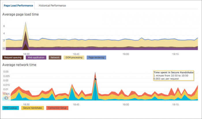
Charts on the Page load performance and Historical performance tabs automatically refresh with comparative performance details for the selected location.

one.newrelic.com > Browser > (select an app) > Browser app > Filterable Geography: Charts on the Page load performance and Historical performance tabs automatically refresh with details for the selected location.
The Page load performance tab shows two charts. The Average page load time chart includes:
- Average page load time for each segment of the page load timing process in seconds
- Request queuing information (the time after a request enters your production systems and before it reaches your application) if applicable
The Average network time chart shows key elements, including how long it takes for DNS lookup, connection establishment, and secure handshake, in seconds.
Tip
Sometimes areas on the charts may appear to be zero or near zero. This is because some apps use existing TCP connections, and they do not need to establish new connections.
The Historical performance tab shows comparison data for the selected time period, yesterday, and last week for the selected location. This includes:
- Average response time
- Throughput in pages per minute (ppm)
Available metrics
You can filter and group geographical performance data with metrics like:
Performance | Metrics |
|---|---|
Webpage |
|
Network |
|
User agents |
|
Performance and usage ranges
The color-coded legend shows performance and usage as percentile ranges.