New Relic Lookout provides visibility across your entire digital estate. It doesn't require any configuration — you can query anything in your estate that matters to you right now and understand your system as a whole, or dive deep into causes and effects, so you can quickly get the data you need to take action.
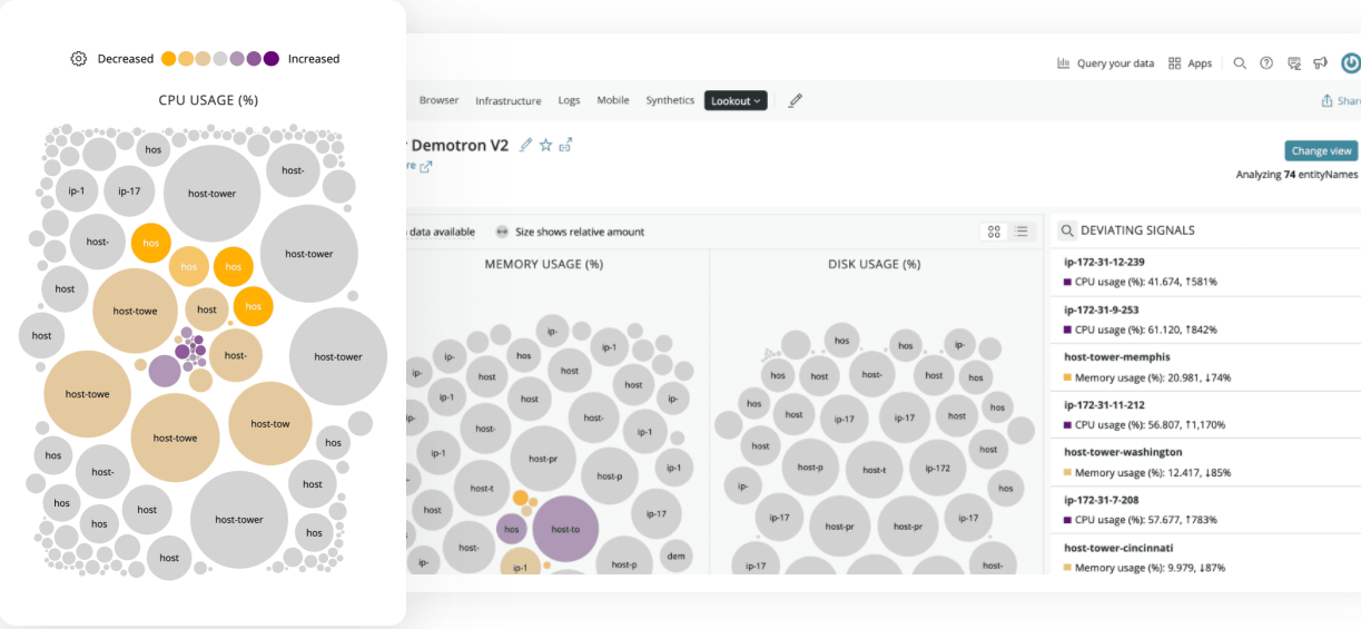
Know exactly where to focus your attention with New Relic Lookout. The brighter the color, the more severe the change, and the bigger the size, the bigger the scale. Then dig deeper with correlations and abnormal history to see how it impacts your whole system—no configuration needed.
Why it matters
New Relic Lookout helps software teams of any size discover potential issues before they have an impact.
- Fill gaps in monitoring with full coverage out-of-the-box, no configuration or setup required.
- Immediately see anything deviating from normal across your entire estate.
- Proactively spot emerging problems in a real-time visualization of all system components.
- Gain faster incidents resolution through automatically surfaced causes and effects.
- Analyze any data in New Relic database (NRDB), including third-party, open, and custom data.
- Launch into other areas of New Relic One for deeper understanding
Requirements
- New Relic Lookout requires Pro or Enterprise edition.
- If you are on Standard edition, you can still use the New Relic Lookout view in the New Relic Explorer. If you want to see data spanning 13-months, correlations, profiles, traces, and other details, you must upgrade to a higher edition.
Get started with New Relic Lookout
To access New Relic Lookout, click the Apps button in New Relic One and locate the New Relic Lookout launcher. You can also access New Relic Lookout directly from the New Relic One header bar, via the More dropdown. Enablement of key service performance indicator data is required for New Relic Lookout to provide value from the data you already have.
The default view provides insight into three key service performance indicators broken down by application: throughput, response time, and errors. These metrics are analyzed to show how the data has behaved during the last five minutes compared to the prior hour.
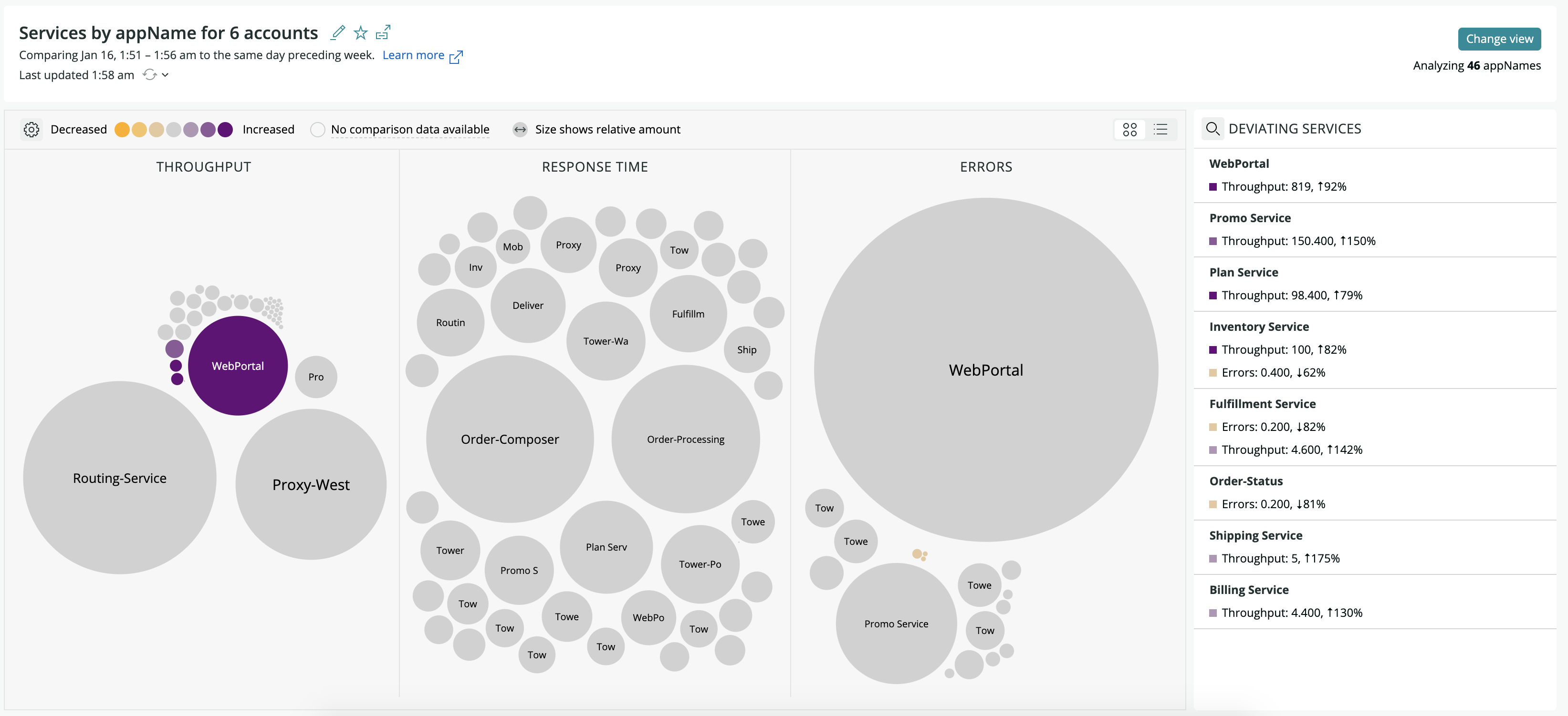
one.newrelic.com > Apps > New Relic Lookout: Anything that significantly deviates from the trend is automatically discovered by New Relic Lookout, which doesn't require any configuration.
Circle visualization and table view
Each application (or other facet) is represented by a circle. The size of the circles indicate the magnitude of the signal for that application and the color indicates whether the value has significantly decreased or increased in the last five minutes, based on the standard deviation of the prior hour (default evaluation and comparison time windows.)
Please note that the type of signal is important when interpreting your results. When you first look at the legend below, you might be tempted to interpret yellow as good and dark purple as bad, but that is not always the case. Here are some examples:
- In the APM/services golden signals, a dark yellow circle in Throughput might signify that something bad has occurred and led to a drop in traffic. At the same time, a dark purple circle might also be concerning due to unexpected load. Both are significant findings worth exploring.
- In browser golden signals, a dark purple circle in Page Views might be great, as you are seeing more traffic to your site!
- With errors golden signals (in all entity types), a large circle, even if gray (not deviating from normal volume), is worth exploring because a high count of errors in your system is important to investigate.

The legend allows you to change the colors used to highlight deviating services
To change the color palette, click the gear icon by the low-high color legend. This allows you to change the colors used to highlight deviating services. To get a table view of the same data, click the toggle on the right. You can also hover over each color to filter the view by degree lower or higher deviance.
Abnormal golden signals
On the right, New Relic Lookout displays the most significantly deviating applications (or other facet) in a side panel, weighted by both the magnitude of the performance indicators and the scale of their deviations. Details include the name of the key performance indicator, their magnitude during the recent time window, and the difference between the averages from one time compared to the other.
Instant search
Click the magnifying glass icon in the side panel to open a search box. Typing into the search box filters the circles, table, and abnormal signals to applications (or other facets) that contain the text. This is a good way to quickly zoom to various subsystems. New Relic Lookout doesn't rerun the analysis when using the instant search.
Change view
Click the Change View button on the right side panel. The panel that appears shows you all the entity-specific golden signals you can toggle between out of the box.
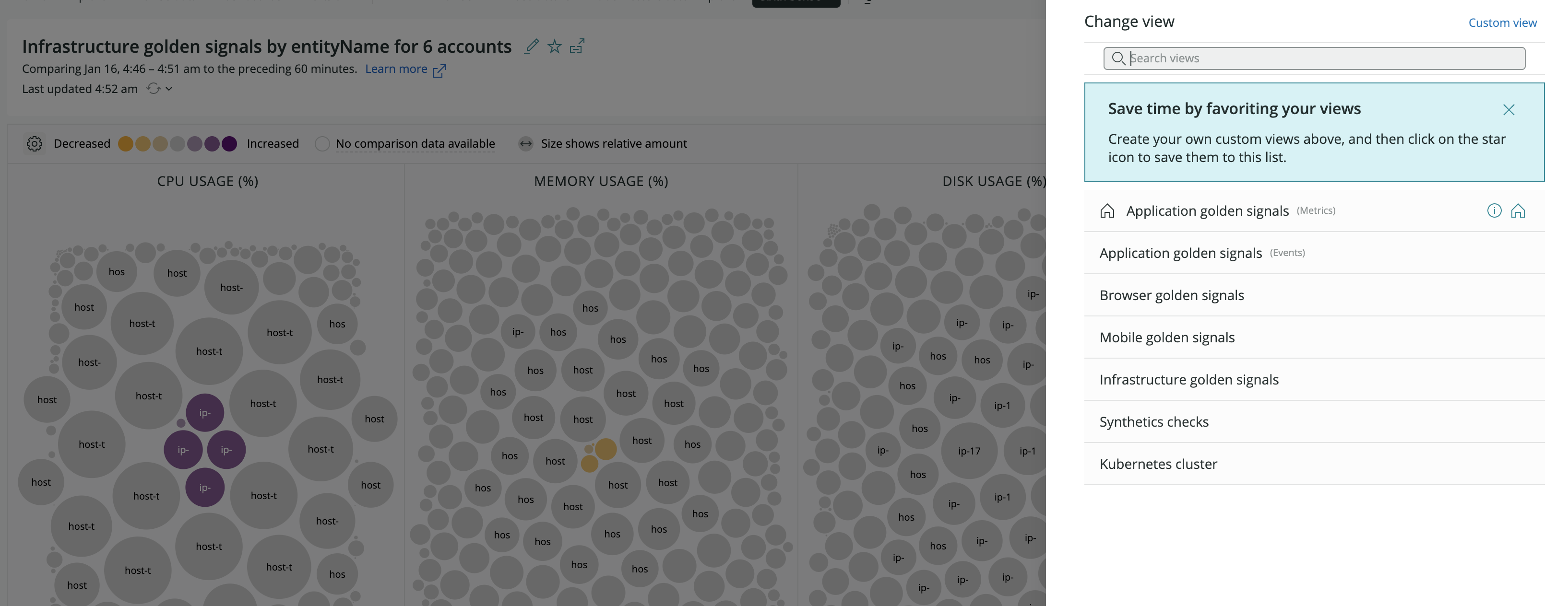
By choosing the Browser Golden Signal or other views, you can change from the default view. Each new view will have the golden signals appropriate for that entity type.
Drill down into the details
To analyze an application or facet, click a circle, table row, or abnormal golden signal. The details panel shows the degree of deviation of the performance indicator, a link to the affected entity, and recent alert and deployment activity for that entity, when available.
There’s also an indication of whether the selected evaluation time period would be abnormal or not in reference to other comparison time windows, such as the same time yesterday or the same time last week. This allows you to quickly see if the abnormal behavior is odd in general, or just based on the comparison time window.
Performance tab
The default tab shows charts for other key performance indicators for the selected application or facet. The charts compare the two time windows being analyzed. You can click their titles to rerun the analysis, focusing on the selected key performance indicator.
When the target is a New Relic One application, we show the top transactions, error classes, external services, and database operations, alongside links to the relevant New Relic One features.
Abnormal History tab
This section analyzes past performance of the selected signal and calls out any time periods with notable abnormalities. Each card represents an abnormal time window and can be clicked for more details. The charts will display any relevant violations and deployments in New Relic.
Correlations tab
New Relic Lookout can find other signals that began behaving differently around the same time as the selected signal for that entity type. Clicking the name of the signal reruns the analysis, focusing on that key performance indicator. The chart titles link to New Relic One when there’s an associated entity in your account. Note that correlations currently do not analyze across accounts. The correlated signals displayed are for others in the account of the original application you are viewing. This helps focus the data on correlations that are more likely related to your issue.
Profile tab
Based on the same technology as New Relic’s error profiles, this tab compares the last five minutes to the prior hour by default (or whatever time windows you’ve selected with query editing) and surfaces any attributes that have significantly different distributions in the events being targeted by the selected signal.
For example, if a custom attribute indicated that a recent throughput spike came from one user, that would surface highly in Profiles if most of the traffic usually comes from many users.
Traces tab
If the entity has distributed traces configured and available in the selected evaluated time window, the Traces section is enabled. Each card shows a summary of a trace and can be clicked for details. The Explore all traces links to the distributed traces application, filtered to the selected entity.
Create a custom view
To target signals and time windows beyond the default values, click the Change view button and select Custom view.
To create your own view:
Select the account or subaccount.
Select the data type (metrics or events). Different functionality is available depending on the type.
In View a chart with, select the metric or event you are interested in. Default is golden signals (throughput, response time, and errors). You can also build custom queries (filters) to target a signal that isn't on the list.
In Facet by, select what the circles represent. Default is
appName, but you can also choosehostor any other facetable attribute available for the signal you’ve selected.If you plan to save/favorite this new view, provide a name in the Name your view box. Keep in mind that you can edit this view at any time using the pencil icon.
The default time windows analyzed by New Relic Lookout are the last five minutes compared to the hour before. Use the time controls (View data from and Compare data to) to target other time windows.
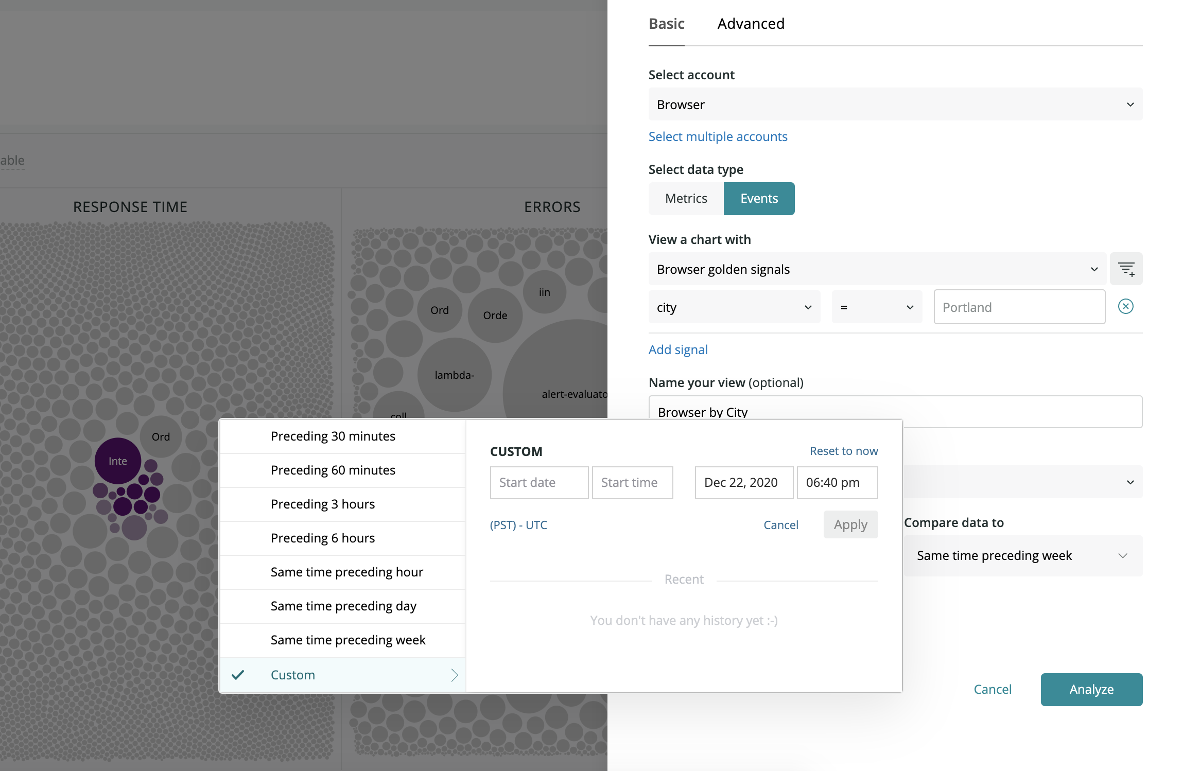
one.newrelic.com > Apps > New Relic Lookout: All event and metric data in the New Relic database can be queried using the Edit query feature.
Click Analyze to begin analyzing the signal you’ve selected.
You can also create your own query:
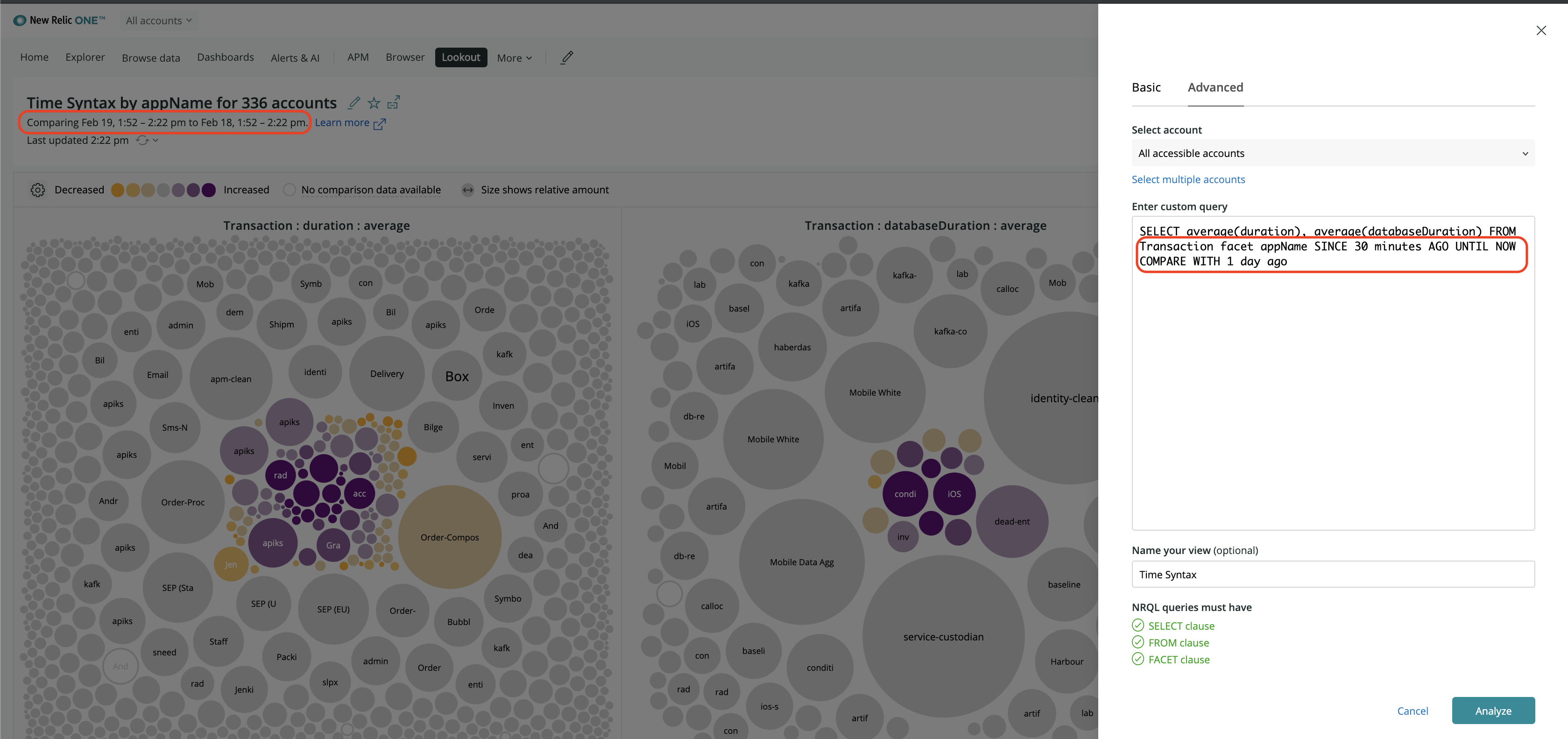
Create your query. This query is comparing data from the past thirty minutes to data from the same range a day ago.
- Change from Basic to Advanced after clicking the Custom view button.
- Select the data type (metrics or events). Different functionality is available depending on the type.
- Enter your query using NRQL. Please note that not all NRQL features are available in the Lookout Advanced query feature.
- By default, the system will run this query using the last five minutes of data compared to the previous hour. Some examples of the syntax for changing the comparison and evaluation time windows are below.
- Click Analyze to begin analyzing the signal you’ve selected.